
Chromatic Flow
Chromatic Flow is more than a phrase. It is a creative method that blends color theory with movement and rhythm to shape memorable visuals across design fashion photography and digital media. Whether you are a designer a content creator or a trend seeker Chromatic Flow offers a framework to craft palettes transitions and moods that feel alive. This article explores the core ideas behind Chromatic Flow practical techniques to apply it and the ways it can transform brand presence and personal projects.
What Chromatic Flow Means
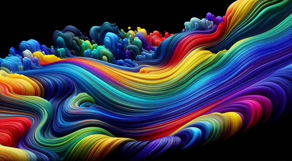
At its core Chromatic Flow describes the intentional progression of color across a composition. Instead of random or static color choices you create sequences that guide the eye and evoke emotion. This flow can be linear circular or based on contrasts and accents. For example a design might move from cool calming blues to warm energizing oranges producing a sense of journey. In photography Chromatic Flow can appear in wardrobe choices background elements and post process color grading. The result is cohesive imagery that tells a story without words.
Why Chromatic Flow Matters for Trends
Trends move quickly but color remains a central driver of taste. Chromatic Flow helps trendsetters and trend followers translate fleeting influences into enduring looks. When you apply Chromatic Flow you are not merely copying a popular palette. You are creating movement and nuance that keeps your work fresh over time. Brands that embrace Chromatic Flow can evolve their visual language while maintaining recognition. For readers and shoppers Chromatic Flow signals thoughtfulness and craft in design and curation.
Principles of Effective Chromatic Flow
Start with a clear emotion or narrative. Colors carry associations so choose hues that align with your intent. Consider balance. Too many competing colors can feel chaotic while too few can feel static. Use contrast strategically to highlight focal points. Think about transitions. Gradual shifts can create calm progression while abrupt shifts can generate tension or surprise. Pay attention to saturation and brightness. Muted tones feel more refined while vivid tones catch attention. Lastly test across contexts. Colors behave differently on screens in print and in physical materials.
Practical Techniques for Designers
One effective method is to create a base palette of three to five colors and then design a scale of tints and shades for each. This provides a toolkit for building flow without losing cohesion. Use gradients and overlays to create smooth blends. In layout consider sequencing elements so that dominant colors appear first and supporting colors follow. Motion design benefits greatly from Chromatic Flow. Animated color shifts can lead viewers through a narrative or call to action. Remember accessibility. Ensure sufficient contrast for readability and consider color blind friendly combinations when needed.
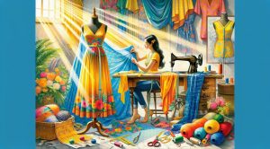
Using Chromatic Flow in Fashion and Photography
In fashion Chromatic Flow can be applied to capsule wardrobes runway styling and editorial shoots. Create looks where garments and accessories move from one hue family to another. Use textiles with subtle variations in tone to create layered depth. For photography plan sets that echo the palette across props clothing and lighting. Post process color grading can enhance the flow by unifying tones and correcting imbalances. The result is imagery that feels curated and intentional which can elevate look books campaigns and social content.
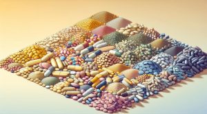
Chromatic Flow for Interiors and Product Design
Interiors benefit from flow when colors guide movement through a space. Transition hues across rooms or maintain a central accent color that ties areas together. In product design consider how a product is revealed. Packaging that moves from neutral wrappers to vibrant interior reveals uses Chromatic Flow to surprise and delight. For physical products surfaces with gradient finishes or multi tone patterns can create visual interest while reinforcing brand identity.
Tools and Resources to Build Chromatic Flow
There are many tools that help you explore color combinations and transitions. Color palette generators allow you to test complementary split complements and triadic schemes. Image editors and grading tools enable precise adjustments in saturation temperature and hue curves. Collaborative mood board platforms help teams align on direction. For inspiration travel and culture can provide unique palettes from landscapes festivals and local markets. If you want to see travel inspired palettes and ideas check out TripBeyondTravel.com for fresh visual references that spark Chromatic Flow concepts.
Case Studies and Examples
Consider a lifestyle brand that wanted to refresh its identity. They used Chromatic Flow to shift from a single brand color to a sequence that conveyed morning rituals with soft pastels transitioning to bold midday hues. The new identity allowed flexible application across packaging social content and retail environments while maintaining recognition. Another example comes from a photographer who used wardrobe and props to guide the eye from foreground to background with a subtle gradient across the frame. This approach increased engagement and led to higher conversion for their commercial clients.
How to Start a Chromatic Flow Project
Begin with research and mood setting. Create a simple brief that states the emotion the audience and the key moments you want to emphasize. Build initial palettes and test them in small mockups. Gather feedback and iterate. Consider creating a style guide that documents palette scales usage rules and transition patterns. This guide will help maintain consistency as projects scale. If you are curious about trend directions and style context for Chromatic Flow you can explore curated picks and long form content at styleradarpoint.com where trend analysis meets practical design tips.
SEO Tips for Content About Chromatic Flow
To maximize visibility for topics around Chromatic Flow focus on clear titles descriptive meta content and structured headings. Use the phrase Chromatic Flow naturally in introductions and major headings while avoiding keyword stuffing. Include visual examples and alt text that describe the color progression. Back links from related sites and social shares from visual platforms increase authority. Consider writing guides case studies and how to articles to capture different user intents. Long form articles with clear subsections perform well for discovery and engagement.
Common Mistakes to Avoid
One common mistake is overcomplicating the palette. Simpler flows are easier to reproduce across mediums. Another trap is ignoring context. Colors that look great on screen may not translate to textiles or print. Failing to document palette rules leads to inconsistent application. Finally avoid relying solely on trends without considering brand values. Chromatic Flow should enhance not replace core brand attributes.
Future Directions
As tools for color manipulation advance Chromatic Flow will become easier to experiment with in real time. AI assisted color suggestions and live preview environments will let creators try complex transitions quickly. The continued blending of physical and digital experiences means that cohesive Chromatic Flow systems will be more valuable for brands that operate across channels. Designers who master this approach will lead trends rather than follow them.
Conclusion
Chromatic Flow is a versatile design approach that brings intentional movement to color. It works across disciplines from branding to interiors and photography. By understanding principles testing palettes and documenting rules you can harness Chromatic Flow to create memorable visuals that stand out. Explore examples study trend insights and practice applying flow in small projects. For curated trend coverage and inspiration visit styleradarpoint.com and for travel driven color ideas view TripBeyondTravel.com. Start experimenting today and let Chromatic Flow guide your next creative direction.