

Clean Contrast A Guide to Modern Visual Balance
Clean Contrast is a design principle that elevates visuals by pairing simplicity with striking separation. Whether you are styling a website a living space or a wardrobe Clean Contrast helps key elements stand out while keeping the whole composition calm and coherent. In this article we explore what Clean Contrast means why it matters and how to apply it across multiple creative fields to boost clarity brand recognition and visual appeal.
What Clean Contrast Really Means
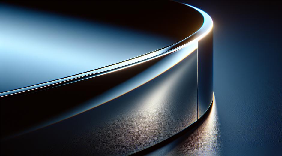
At its core Clean Contrast is about clarity achieved through thoughtful opposition. Contrast does not mean loudness alone. It is the art of creating a clear relationship between elements so that each item has purpose and space. Clean Contrast relies on limits it favors fewer but stronger choices a clear hierarchy and generous use of neutral space. The result feels modern intentional and easy to read for an audience.
Why Clean Contrast Matters for Brands and Creators
In a crowded visual world Clean Contrast helps messages land faster. When a logo color a headline or a product is framed with clean contrast the viewer processes the message with less effort. That ease of processing increases recall and trust. Brands that use Clean Contrast effectively appear more polished more premium and easier to engage with. For creators the same rule improves portfolio presentation and social media content so that key works receive the attention they deserve.
Color Rules for Clean Contrast
Color is the easiest way to create contrast. Yet the most powerful Clean Contrast outcomes come from pairing a dominant neutral with a single accent color. Neutrals like white cream charcoal and soft gray create calm fields where an accent color can register with clarity. For example a warm amber button on a charcoal field or a rich teal accent on a soft cream backdrop will draw the eye without chaos.
Another approach is to use tonal contrast. Rather than introducing a new hue you can pair very light and very dark tones of the same hue. This keeps the palette cohesive while still delivering readable separation between elements.
Typography and Clean Contrast
Typography is central to Clean Contrast because type creates the narrative of a layout. Choose one strong display typeface for headlines and pair it with a simple readable typeface for body text. Use size weight and spacing to create hierarchy. White space around headlines is a powerful contrast tool that amplifies the message without adding clutter.
Space and Composition
Space is not empty space. In Clean Contrast space is active. Generous margins and consistent gutters allow elements to breathe and the eye to move naturally. Alignments that honor a grid system create predictable rhythm. That rhythm makes any contrast choices feel deliberate. A crowded layout will undercut contrast no matter how bold the color or type choices are.
Applying Clean Contrast in Web Design
On the web Clean Contrast improves accessibility and conversion. High contrast between text and background increases legibility which benefits all users. Use a dominant neutral background paired with a clear accent color for calls to action. Keep navigation simple and use contrast to guide users to primary actions. For inspiration check curated examples on styleradarpoint.com where well executed layouts show how restraint can feel bold.
Clean Contrast in Photography and Visual Content
Photography relies on contrast in tone color and texture. Clean Contrast in photography is achieved by isolating the subject from busy backgrounds using shallow depth of field or by shooting against clean backdrops. Natural light can create soft contrast that highlights form and texture. When editing choose subtle adjustments to exposure and color so that the subject maintains a natural presence while standing apart from the environment.
Interior Design and Clean Contrast
In interiors Clean Contrast creates spaces that feel intentional and restful. Start with a neutral base for walls floors and large furniture. Introduce contrast through a single strong accent piece a rug or an artwork. Contrast can also be textural for example pairing a smooth matte surface with a woven textile adds depth while keeping the visual language simple. The goal is a space that reads quickly and feels layered not chaotic.
Fashion and Personal Styling
For personal style Clean Contrast keeps outfits polished. A monochrome base layered with one bold piece creates a confident look without effort. Contrast can be created with color value as well for example pairing a pale top with a deep pant creates a clear separation that elongates the form. Accessories can act as accents but less is often more. Clean Contrast in dress communicates clarity of taste and attention to detail.
Practical Steps to Create Clean Contrast
Follow a clear process when you set out to apply Clean Contrast. First define the primary goal of your project. Second limit the palette and select one accent. Third choose type and tune sizes for hierarchy. Fourth add space and check alignments. Finally test the design at multiple sizes and in real world contexts to ensure the contrast reads the way you intend across mediums.
Tools and Resources
There are many free and paid tools that help you test contrast and refine choices. Contrast checkers help confirm accessible color pairings. Mood boards assist in assembling a cohesive group of visual references. If you seek natural materials and products that complement Clean Contrast aesthetics consider learning more from brands that focus on purity of material use and clear product photography. One resource for nature inspired wellness and visually clean offerings is BioNatureVista.com which highlights products that pair well with minimalist environments and clean visual schemes.
Common Mistakes to Avoid
Do not confuse contrast with clutter. Adding many contrasting elements will erode the clarity you intended. Avoid too many accent colors too many typefaces or random textures. Also avoid contrast choices that reduce accessibility such as low contrast text. Test early and often and be prepared to remove elements that do not serve the hierarchy.
Measuring Success
Success with Clean Contrast can be measured by engagement clarity and recall. For digital projects monitor metrics like time on page bounce rate and conversion rates. For physical spaces observe how people move within the space and which items draw attention. For branding run simple recall tests with users to see which elements they remember. Often small adjustments in contrast will yield outsized improvements in performance.
Closing Thoughts
Clean Contrast is a versatile approach that applies across many creative fields. It asks designers and creators to choose deliberately to let each choice earn its place. The payoff is a clearer message stronger brand identity and visuals that attract attention for the right reasons. By limiting choices focusing on hierarchy and honoring space you can create work that feels both modern and timeless.
If you want more curated ideas and examples to inspire your next project visit the site mentioned above to explore trends and case studies that show Clean Contrast in action.