Modern proportions The New Language of Design
Modern proportions shape how we perceive space form and function. From urban architecture to wearable fashion from web interfaces to product shells the idea of measured balance guides creative choices. This article explores why Modern proportions matter how to apply them and which simple rules can help you craft visually pleasing outcomes that feel fresh and timeless.
Why Modern proportions matter
Proportion is the relationship between parts and a whole. Modern proportions update classic ideas about balance and rhythm for a contemporary context. They respond to new lifestyles new materials and new technologies. They guide attention they create hierarchy and they make objects and spaces feel comfortable or expressive depending on intent.
Design that ignores proportion can seem awkward or heavy. Thoughtful proportion offers clarity. It helps users understand how to interact with a surface a room or a device. For brands it communicates personality. For makers it reduces waste and improves cost control by aligning parts in coherent systems.
Core principles behind Modern proportions
There are a few key principles that recur in successful projects. First use contrast to create focus. Large planes married with slender details can create a sense of elegance. Second pursue rational scales. Modular units and grid based thinking allow flexibility across sizes and contexts. Third aim for human centric measures. A stair a counter a button should feel correct for the people who use it.
Another constant is adaptability. Modern proportions often include scale choices that work across more than one condition. That is evident in responsive interface design and in furniture that adapts to small and large living spaces. Designers favor proportions that can expand or contract without losing character.
Applying Modern proportions in architecture and interiors
In architecture proportion affects room height window placement and furniture scale. Modern proportions lean toward generous volumes with restrained detail. Large windows paired with slim frames allow daylight to shape interiors without interrupting sight lines. Inside a residence choosing a consistent ratio for ceiling heights steps and shelving creates a calm flow.
Practical steps include establishing a base module. Choose a unit such as the height of a shelf or the width of a doorway and repeat it across elements. This produces cohesion. Another step is to test sight lines. Walk the space at eye level and adjust the scale of elements until they feel right. If you need inspiration and trend reports that include modern living ideas visit styleradarpoint.com for curated examples and commentary.
Modern proportions in fashion and accessories
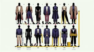
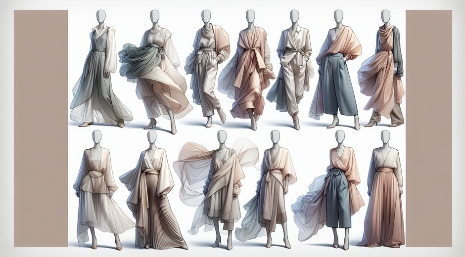
Fashion uses scale to play with silhouette and movement. Modern proportions often combine oversized geometry with refined details. That contrast creates drama without clutter. For accessories the rule is similar. A bag or a watch with clear ratios between case and strap or body and handle will age better visually.
When planning a collection think in layers. Start with basic body proportions then add elements that alter perception. A long coat can be balanced with cropped trousers. A wide sleeve can be tempered with a high collar. Sampling at multiple sizes helps ensure the language of proportion works across bodies and markets.
Using Modern proportions in web and product design
On screens proportion guides readability and interaction. Modern interfaces favor generous spacing between blocks clear typography scale and a hierarchy that helps users scan. Grid systems remain central. They let designers place components in ways that feel deliberate and organised.
For product design choose control sizes that match human fingers and eyes. Buttons corners and input fields should be scaled to reduce error and enhance comfort. Think in terms of rhythm. Repeating an element at consistent intervals creates patterns that the eye follows naturally.
Gaming interfaces offer a compelling field where Modern proportions can be explored. From inventory panels to minimaps the balance between game world and overlay elements determines immersion. For the latest news on game design trends and interface experiments explore industry coverage at GamingNewsHead.com.
Tools and methods to define Modern proportions
Several practical tools help implement proportion with precision. Grids and modular scales are essential. Modular scale is a system where you choose a base unit then generate a range of sizes from it. This brings harmony to typography and spacing. The golden ratio and simple integer ratios remain useful but they are not rules only options that should be tested against context.
Sketching with paper models or simple cardboard prototypes lets you test three dimensional relationships quickly. In digital work use variable type systems responsive layout tools and component libraries that enforce consistent spacing. Frequent critique sessions with peers help reveal proportional imbalances that you may not notice when immersed in a project.
Case studies and trends using Modern proportions
Consider a small apartment renovation. Designers who use Modern proportions often open sight lines by lowering partitions and aligning storage heights. The result feels larger and more cohesive. In retail a shop using tall display planes with low counters creates a clear path through the store while keeping attention on key items.
In product development companies are moving away from exact mimicry of classic shapes. Instead they reinterpret familiar proportions with modern materials. A chair may retain a familiar seat to back relationship while its legs are refined using new composites. This creates a sense of continuity with an update that feels current.
Common pitfalls and how to avoid them
One pitfall is over reliance on a single idea. Using the same large to small contrast for every element can feel predictable. Inject variety by changing rhythm and introducing subtle asymmetry where appropriate. Another pitfall is ignoring context. A proportion that works for a show piece may fail in a mass market setting where manufacturing limits matter.
Testing at scale matters. A small mockup may look perfect but when enlarged or reduced the relationships can break down. Always test designs in the real conditions where people will use them. Solicit honest feedback and iterate fast.
Creating a style guide for Modern proportions
For teams a style guide captures proportional rules. Include a base module a type scale spacing rules and component size ranges. Also specify exceptions and the reasoning behind choices. When everyone understands the proportional system the brand voice stays consistent across channels.
Document the rationale. Explain why a ratio was chosen and under which conditions it may be adjusted. This helps future designers preserve intent while adapting to new needs.
Looking ahead
Modern proportions will continue to evolve as new materials production methods and human behaviors emerge. The key is to focus on human experience and adaptability. Designs that prioritize these qualities will feel purposeful and enduring. By combining classic understanding with modern tools you can create work that resonates now and remains flexible into the future.
Conclusion
Modern proportions are a practical language for contemporary design. They guide choices across scales and disciplines. Whether you are working on a room a garment an app or a product the deliberate use of proportion improves clarity cohesion and delight. Start by defining a base module test across contexts and document your rules. That process will help you create designs that are both modern and meaningful.


