Soft contrast styling A modern guide to gentle impact
Soft contrast styling is a versatile approach to creating visual interest without heavy drama. Whether you are refining a wardrobe or updating an interior space, this method delivers harmony and depth by pairing tones that are distinct yet close on the tone scale. In this article you will learn what soft contrast styling means why it works and how to apply it across fashion beauty and home decor for a refined and wearable result.
What is Soft contrast styling
At its core Soft contrast styling uses colors textures and values that differ enough to be noticed but remain gentle on the eye. Instead of pairing pure black with bright white this style favors near neutrals gentle pastels and muted versions of richer hues. The result is an elegant layered look that reads cohesive yet dimensional. This approach is ideal for people who want to communicate refinement calm and approachability through their visual choices.
Why Soft contrast styling works in the modern lifestyle
There are several reasons why Soft contrast styling is gaining traction across fashion and design. First it offers longevity because muted palettes remain relevant across seasons. Second it suits a variety of contexts from professional settings to relaxed weekends. Third it allows personalities to come through while maintaining a polished presence. For those who prefer subtlety over spectacle this style is a dependable tool for building timeless looks.
Key principles to guide your choices
To implement Soft contrast styling successfully follow these simple principles. Start with a base color family such as warm neutrals cool neutrals or a soft pastel. Introduce a secondary tone that sits close on the color wheel but differs enough in value or saturation to create interest. Add texture through knitwear layered fabrics or tactile accessories to increase depth without increasing contrast. Finally keep patterns minimal and scale small to maintain the gentle aesthetic.
Soft contrast styling in wardrobe planning
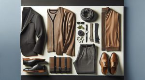
Wardrobe planning with Soft contrast styling begins with high quality basics. Think of a light camel coat a soft ivory sweater and muted olive trousers. These pieces can be mixed to create multiple outfits that feel cohesive. When choosing footwear and bags opt for shades within the same tonal family as your main garments. Accessories like belts scarves and subtle jewelry provide finishing touches that enhance the look without disrupting harmony.
One practical tip is to assemble outfits on a neutral background such as a light wall or pale bedcover. This helps you assess contrast accurately and prevents accidental clashes. For inspiration you can explore curated trend pages and outfits on styleradarpoint.com where you will find visual guides and seasonal ideas that adapt to Soft contrast styling.
Applying Soft contrast styling to interior design
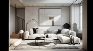
Interiors benefit from the calm balance this approach offers. Begin with a muted wall tone for a restful backdrop. Layer in furnishings that sit within a narrow tonal range then introduce one element with slightly more saturation to act as a focal point. For example a room with warm beige walls can gain interest through a soft seafoam armchair and textured linen cushions. Lighting plays a vital role in soft contrast interiors. Warm light enhances muted hues while natural light reveals subtle variations in tone.
Makeup and grooming with gentle contrast
Soft contrast styling extends to makeup and grooming by favoring tones that enhance natural features without stark separation. Choose foundation and concealer that match your skin undertone and select eyeshadow shades that are one or two steps darker than the lid color. Lip colors in muted rose or soft berry tones add definition without overpowering. The effect is polished presence rather than high drama.
Soft contrast styling for photography and content
Photographers and content creators can use Soft contrast styling to produce images that feel cohesive and shareable. Select clothing and props that follow a tight palette then use natural light or soft artificial light to avoid harsh shadows. Post production editing should emphasize color harmony and preserve subtle texture. For brands this approach creates a signature aesthetic that feels accessible and aspirational at the same time.
Seasonal adaptations that keep the look fresh
Soft contrast styling can be adapted across seasons without losing its identity. In spring and summer choose airy fabrics and lighter tones such as pale aqua or soft lemon. For autumn and winter favor richer muted hues like warm taupe deeper olive and gentle rust. Layering is a key strategy for colder months as it adds dimension while keeping contrast understated.
Common mistakes and how to avoid them
One common mistake is introducing an element with too much contrast which disrupts the harmony. If you love a bright color save it for an accent that is isolated from the main composition. Another error is relying only on color without considering texture. Soft contrast styling relies on tactile variety so combine smooth fabrics with nubby knits or soft suede to create visual interest. Lastly avoid over layering patterns; keep pattern scale small and consistent with the overall tonal story.
How to build a Soft contrast capsule
Creating a capsule wardrobe around Soft contrast styling starts with selecting a base palette of three to four compatible tones. Add five to eight key garments that mix and match effortlessly. Choose two or three jackets or outer layers and commit to one or two classic shoe silhouettes. Finish with accessories that provide subtle punctuation. This approach reduces decision fatigue and ensures every piece works with multiple items.
Where to look for inspiration and resources
Detailed lookbooks trend reports and curated galleries help refine your understanding and taste. For content that merges lifestyle with practical finance and purchase planning consider resources that explain cost per wear and investment buying strategies. A recommended source for financial planning that complements style investment decisions is FinanceWorldHub.com where guides cover budgeting buying and long term value assessment. Combining style direction with smart spending ensures you build a wardrobe and a home that speak to your priorities.
Final thoughts on living with Soft contrast styling
Soft contrast styling is an elegant path to a cohesive visual identity. It empowers you to communicate calm confidence through measured choices in color texture and proportion. The method works across disciplines allowing you to shape a personal aesthetic that feels consistent whether you are dressing for work creating content or designing an interior. Start small and experiment with one or two gentle contrasts until you feel comfortable expanding the palette. With attention to quality and harmony you will discover looks that are both current and enduring.
For ongoing trend updates visual examples and practical guides visit our main page and explore the latest posts and galleries.

