


Color Blocking: A Bold Guide to Mastering Contrast in Fashion and Design
Color Blocking is a timeless trend that keeps returning to runways and interiors with fresh energy. It is the art of pairing blocks of solid color to create striking visual statements. Whether you are updating a wardrobe or refreshing a living room, mastering Color Blocking will give you a toolkit for bold style choices that feel intentional and modern. This guide covers core principles, practical steps, palette ideas, and common mistakes to avoid so you can adopt Color Blocking with confidence.
What is Color Blocking
Color Blocking is a design technique that uses large areas of solid color placed next to each other to form a high impact composition. In fashion, this might be a dress with a bright panel at the waist and a contrasting sleeve. In interiors, it can be a wall painted one hue paired with furniture in another. The goal is to emphasize shape and structure while letting color do the emotional work.
Historically designers used Color Blocking to simplify visual information and to guide the eye. Today the trend is accessible to everyone because it does not require expensive pieces. A few well chosen items or a fresh coat of paint can transform an outfit or a room.
Why Color Blocking Works
Color has the power to influence mood and perception. When you place colors next to each other in large areas, their relationship becomes the focal point. Color Blocking works because it:
– Creates strong visual hierarchy by isolating areas of attention
– Makes simple silhouettes feel dynamic and modern
– Allows you to play with contrast without relying on prints or patterns
– Offers a clean way to mix unexpected colors while retaining balance
Designers often use Color Blocking to highlight proportions. For example, placing a darker block at the bottom of an outfit can ground a look. Using a lighter block near the face draws attention upward. These tricks let you shape perception with color.
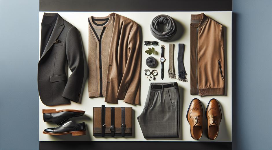
How to Start with Color Blocking in Your Wardrobe
If you are new to Color Blocking, start with small experiments. Follow these steps to build confidence:
1. Choose two to three colors only. Limiting your palette keeps the look cohesive.
2. Use one neutral base item. A neutral base like white, black, or beige helps anchor stronger colors.
3. Try contrasting values rather than clashing tones. Pairing one light color with one dark color often looks more polished than pairing two similarly bright colors.
4. Mix textures to add depth. Smooth fabrics beside textured ones create interest without adding visual clutter.
5. Balance proportions. If you wear a big block of bright color on top, opt for a simpler bottom to avoid overwhelming your silhouette.
A simple outfit to try is a teal top with a mustard skirt and neutral shoes. If you prefer more subtlety, pair navy with blush for a refined take on Color Blocking.
Color Blocking for Every Body Type
Color Blocking adapts well to different body types when you use blocks to highlight or downplay areas. For example:
– To elongate the torso, place a vertical block in the center.
– To create the illusion of curves, use contrasting side panels.
– To emphasize the waist, choose a belt or garment with a contrasting waist block.
The key is to understand how color placement influences proportion. Small changes can produce large effects, so experiment with pinning fabrics or trying on pieces in front of a mirror before committing.
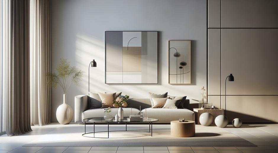
Color Blocking in Home Design
Color Blocking is not limited to fashion. In interior design, it can create striking rooms with minimal effort. Try these ideas:
– Paint one wall a bold color and keep the rest neutral to create an accent block.
– Use area rugs and sofas in complementary solid colors to define zones in an open plan room.
– Mix cabinetry colors in kitchens for a playful yet sophisticated look.
When applying Color Blocking at home, consider the room function. Bedrooms benefit from calming palettes with one contrasting accent. Living rooms can handle brighter combinations that energize conversation areas.
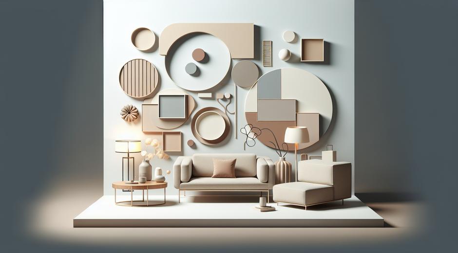
Choosing Palettes That Work
A successful palette often balances color temperature and intensity. Here are palette ideas to inspire you:
– Cool and warm contrast: teal with coral
– High contrast classic: black with white plus a pop of red
– Soft modern: blush with gray and a dash of navy
– Earthy jewel mix: olive with rust and cream
If you need travel and cultural inspiration for palettes, explore resources that highlight destination color stories. For example, travel guides often showcase local textiles and landscapes that can spark fresh combinations. For curated travel content that can inspire your next palette explore TripBeyondTravel.com.
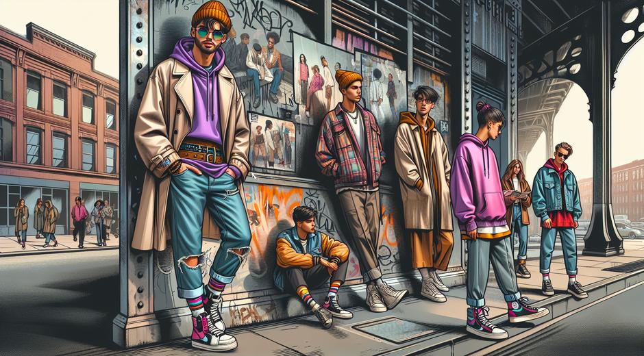
Practical Tips for Shopping and Styling
When shopping for Color Blocking pieces keep these tips in mind:
– Look for garments with clear blocks of color rather than busy patterns.
– Consider separates that you can re mix with existing items.
– Invest in one statement piece per season to refresh your wardrobe.
– Use accessories to test combinations before committing to clothing or paint.
For ongoing trend updates and styling ideas visit trusted lifestyle hubs like styleradarpoint.com where you can find seasonal guides and visual mood boards.
Common Mistakes and How to Avoid Them
Even simple techniques can go wrong if you rush. Common mistakes include:
– Using too many colors at once which creates visual noise
– Choosing colors that have similar intensity which can look muddy
– Ignoring proportion so that blocks compete with silhouette
– Forgetting context such as lighting which alters how color reads
Avoid these pitfalls by testing combinations in natural light and limiting the number of blocks to two or three. Photographs on your phone can help you evaluate how colors interact when viewed at a distance.
Color Blocking Beyond Clothing and Interiors
Color Blocking extends to graphic design, product packaging, and branding. The method is ideal when you need immediate recognition or a bold statement. Brands use blocks of color to direct attention to logos or calls to action. Web designers apply Color Blocking to create clean layouts that guide users through content.
When applying Color Blocking digitally, consider screen calibration and contrast ratios to maintain accessibility. High contrast blocks can be striking but ensure text remains readable.
Conclusion
Color Blocking is a versatile technique that can refresh a wardrobe, define a room, or strengthen a visual identity. Start small by experimenting with two color blocks and a neutral anchor. Observe how placement changes perception and tailor palettes to mood and function. With thoughtful practice you will develop a personal approach that feels bold and curated.
Whether you are a trend follower or a creative who loves color, Color Blocking offers endless possibilities for expression. Use the tips in this guide to create combinations that look modern and intentional. Explore seasonal palettes and keep an eye on inspiration sources to evolve your approach over time.