

Muted Tones A Complete Guide to Subtle Color Trends
Muted tones are one of the most enduring trends across style decor and visual culture. They offer calm balanced palettes that feel modern without shouting for attention. Whether you work in fashion photography interior design branding or content creation understanding how muted tones work will let you craft looks and spaces that feel curated and timeless. This guide covers what muted tones are why they work and how to use them with confidence in multiple creative areas.
What Are Muted Tones and Why They Matter
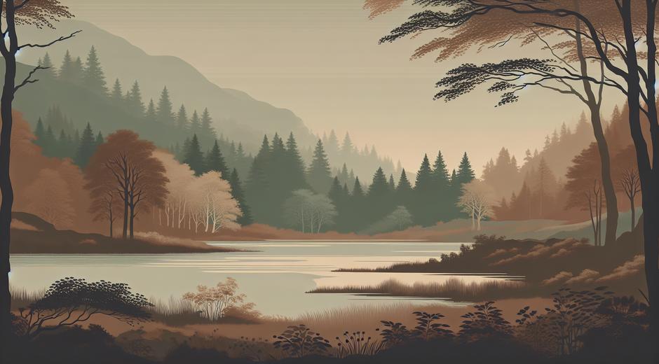
Muted tones are colors that have been softened by mixing in gray or a complementary amount of their opposite. The result is a less saturated and more understated shade. Think of dusty roses moss green warm beige and soft slate blue. These colors do not compete for attention. They create mood rather than demand it. For spaces and images that aim to feel peaceful refined and cohesive muted tones are ideal.
From a trend perspective muted tones are versatile. They adapt to minimal urban interiors cozy rural settings elegant workplaces and relaxed fashion. Because muted hues read as natural many designers also pair them with sustainable materials and simple forms to amplify an organic feeling. Search demand for muted tones has grown as people look for calm visual expression in a busy digital world.
How to Build a Muted Palette
Creating a balanced muted palette begins with selecting a primary muted color then adding supporting neutrals and accents. Start with one main muted tone for example a soft sage or a warm camel. Pair it with a neutral base like off white warm gray or deep charcoal. Introduce one or two accent muted tones for variation such as a pale terracotta or a washed teal. Keep saturation low across the board to maintain cohesion.
Texture plays a role as important as color. Textured linens brushed metals matte ceramics and raw wood help muted tones feel rich instead of flat. When working digitally consider lowering saturation and raising brightness slightly to avoid muddy results. In print test swatches under different lighting to ensure the muted effect reads as intended.
Muted Tones in Home Design
Muted tones are a favorite for home interiors because they create calm restful environments. Walls in muted colors act as a soft backdrop that allows furniture art and plants to stand out. A living room painted in a muted clay with linen sofas and woven rugs feels warm and inviting. In bedrooms muted blues and greens promote rest and help other details like bedding and lighting become focal points.
Layering is key. Use a mix of materials and finishes to keep spaces interesting. A muted palette of sand and sage gains depth when you add a matte black lamp a woven basket and a stone coffee table. Lighting will change how muted tones appear through the day so choose bulbs and window treatments that enhance the warmth or coolness you want to emphasize.
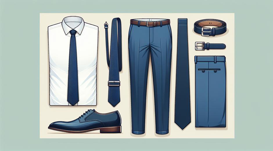
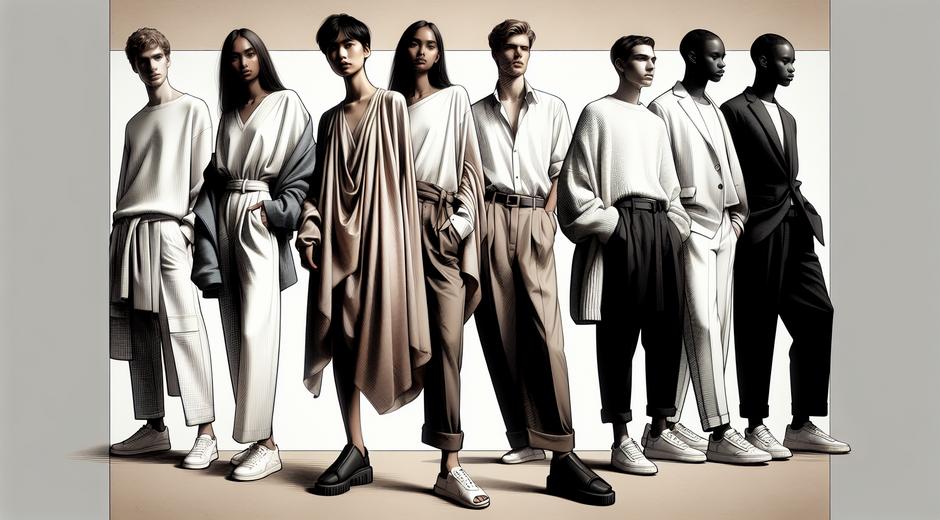
Muted Tones in Fashion and Personal Style
In fashion muted tones translate to wearable pieces that look refined and effortless. A capsule wardrobe built on muted colors will mix and match easily while feeling cohesive. Fabrics matter. A wool coat in a muted charcoal or a silk blouse in a soft mauve conveys luxury without ostentation. For accessories muted tones allow texture and form to shine so braided leather or carved jewelry become defining accents.
When styling keep contrast moderate. Pair lighter muted tones with deeper ones to create silhouette definition. Muted tones are flattering in photography because they do not reflect intense color onto skin. For seasonal shifts introduce slightly warmer muted tones in cooler months and cooler muted tones in warm months to reflect subtle seasonal cues.
Muted Tones in Branding and Visual Content
Brands adopt muted tones to appear approachable and trustworthy. A muted palette communicates restraint and attention to detail. When building a brand kit choose one or two muted primary colors supported by neutral backgrounds and a single bolder accent for calls to action. Use imagery that includes natural textures and real life moments to reinforce a human centered aesthetic.
In social media posts muted tones can help your content stand out in a sea of bright saturated images. Consistency is the key. Apply the same muted color family across photography filters typography and graphic elements to create a recognizable visual language. For editorial projects muted color grading lends a cinematic calm that supports storytelling without distraction.
Pairing Muted Tones With Materials and Patterns
Muted tones pair beautifully with organic materials. Think raw wood linen clay and stone. These pairings create a tactile harmony that supports a muted palette. For patterns prefer subtle repeats like small scale geometrics tone on tone florals or gentle stripes. Heavy contrast patterns can overpower the quiet nature of muted colors so choose patterns that reinforce rather than compete.
Metal finishes should be chosen to complement the warmth or coolness of your palette. Warm muted tones work well with brushed brass and aged copper. Cooler muted tones pair with satin nickel and pewter. Matte finishes often work better than glossy ones to maintain the understated look.
Color Combinations to Try
Here are simple muted combinations to inspire projects across home style and brand identity.
1 A muted olive base with soft beige and a light terracotta accent creates a grounded warm scheme.
2 A dusty blue main color with warm gray and a pale mustard accent feels fresh and refined.
3 A muted mauve paired with cream and a soft taupe accent is elegant and understated.
4 A soft slate paired with off white and a deep charcoal accent is modern and calm.
Seasonal Use and Longevity
Muted tones offer longevity because they are not tied to a single season of bold trends. To update a muted wardrobe or space for a new season swap small elements. Add cushions with different textures update lighting and rotate artwork. These small changes refresh a muted palette while preserving its cohesive foundation.
Because muted tones are subtle they tend to hide wear and staining better than very light or very bright colors. For high use items choose durable fabrics and finishes so the muted aesthetic remains appealing for years.
Sustainability and Ethical Sourcing
Muted tones often align with a sustainable approach because they pair well with natural fibers and timeless designs. Choosing quality materials that age gracefully extends the life of an item and reduces waste. For those seeking ethically produced items in muted palettes there are curated platforms that focus on sustainable craftsmanship and mindful production. A good option for sourcing items with strong environmental credentials is to check brands that publish full material and factory information and that prioritize low waste production models like those featured at Ecoglobalo.com.
Finding Inspiration and Staying Current
Trends shift gradually within muted palettes. To stay inspired study classic design eras modern photography and nature. Mood boards are a practical tool. Collect material swatches fabric samples and color chips and test them in your actual space or lighting. If you want curated trend reporting and practical styling ideas visit styleradarpoint.com to discover fresh angles on muted color trends and practical how to content.
Final Thoughts
Muted tones offer a flexible calm and timeless approach to color that suits many creative needs. By focusing on balance texture and subtle contrast you can use muted palettes to create spaces outfits and visuals that feel deliberate and enduring. Embrace the quiet power of muted tones and allow texture and form to tell the story. With a few smart choices your work will feel cohesive natural and memorable.