Quiet Contrast
Quiet Contrast is a subtle design concept that creates strong visual or emotional impact without loud elements or bright noise. It relies on restraint and careful balance to let simple differences speak loudly. In a world where loud statements often crowd attention many creators and consumers are turning to a softer approach. Quiet Contrast appears in fashion interior design photography and brand identity. It can transform a space an outfit or a story in a way that feels refined and memorable.
What Quiet Contrast Means in Practice
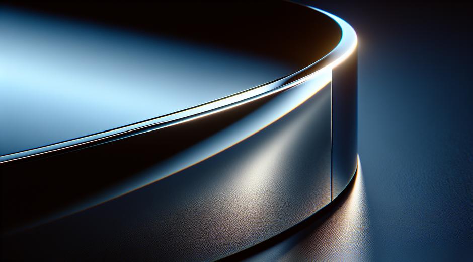
At its core Quiet Contrast is about opposition that does not shout. It uses differences in tone texture scale and placement to guide the eye and suggest focus. Instead of extreme color change the approach favors muted palettes with one or two key elements that create attention. Instead of bold pattern clash the approach favors texture play and precise proportion. The result is an impression of depth clarity and calm energy.
Why Quiet Contrast Matters for Trends
Trends evolve toward simplicity once the market reaches saturation for loud maximalism. Quiet Contrast answers a growing desire for longevity and versatility. Designs that apply this concept translate easily across seasons and contexts. A living room that uses soft grey walls and a single warm wood tone will feel current for years. A fashion capsule built on neutral shades with a single piece of clever tailoring will carry through seasons. That slow burn quality makes Quiet Contrast a strategic tool for anyone building a lasting aesthetic.
Quiet Contrast in Interior Design
Applying Quiet Contrast to interiors begins with a clear choice of base palette and one contrast element. Start with a canvas of soft neutrals like warm beige charcoal or slate. Then introduce contrast with texture and scale. A large linen sofa paired with a small leather chair creates contrast via material and size rather than bright color. Layer rugs throws and ceramics to add tactile interest that reads as rich yet subtle. Lighting plays a major role. A soft warm lamp placed near a matte wall will create depth without breaking the calm mood.
Practical tips include using natural materials in different finishes choosing one accent color in a muted tone and keeping ornamentation selective. Use repetition to build cohesion. When repeated sparingly a single design motif becomes the anchor for the room. For inspiration and lifestyle ideas you can explore fresh trend articles at styleradarpoint.com which covers current approaches and real life examples.
Quiet Contrast in Fashion
In fashion the idea is to mix shapes textures and small tone shifts to craft an outfit that feels thoughtful. Think of pairing a soft oversized knit with tailored trousers. The contrast is about form not color intensity. Or wear a tonal outfit where fabric texture creates the difference. Matte and silk in the same shade will read as deliberate contrast. Jewelry and footwear should be chosen for proportion and finish rather than color pop. Quiet Contrast lends itself well to capsule wardrobes because it encourages versatile pieces that work together in many combinations.
Quiet Contrast in Photography and Film
Cinematographers and photographers use Quiet Contrast to tell quieter stories. This method emphasizes mood and nuance over spectacle. A scene lit with gentle sidelighting and muted color grading will draw attention to subtle expressions and small actions. Directors who favor this approach often focus on human detail and atmosphere. If you want to see cinematic examples that embody subtle contrast and mood driven storytelling visit Moviefil.com to discover films and visual essays that illustrate these ideas.
Quiet Contrast in Branding and Digital Design
For brands Quiet Contrast communicates sophistication and trust. Websites and apps that use restrained palettes clear visual hierarchy and deliberate whitespace feel easier to use. Typography should be chosen for clarity and character. A brand might pair a heavy serif for headlines with a light geometric sans for body text. The contrast is structural and aesthetic rather than color loudness. This approach is powerful for brands that want to be perceived as enduring and human.
How to Implement Quiet Contrast Step by Step
Start with analysis. Identify the primary mood you want to convey and list the key functional needs. Choose a restrained palette of two to four tones with one element reserved for contrast. Decide if contrast will come from texture scale color or negative space. Prototype with small changes and evaluate in real contexts. For interiors test with cushions and lamps before committing to furniture. For web design mockup typographic pairs and spacing rules. Review and refine until the composition reads cohesive and calm.
When choosing elements keep these rules in mind
- Less is more. Quality of each element matters more than quantity
- Favor natural materials and finishes for depth
- Use repetition to create rhythm
- Let negative space be an active part of the composition
- Test contrast under real lighting and viewing conditions
Common Pitfalls and How to Avoid Them
One common mistake is mistaking quiet for bland. Quiet Contrast must still include intention and a clear focal point. Use scale or texture to create that point. Another mistake is over relying on neutral color. Even subtle accent hues can bring warmth and personality. A third trap is poor proportion which can flatten the design. Always check balance from different viewpoints and distances. Iteration is the guard against these issues.
Examples That Demonstrate the Power of Quiet Contrast
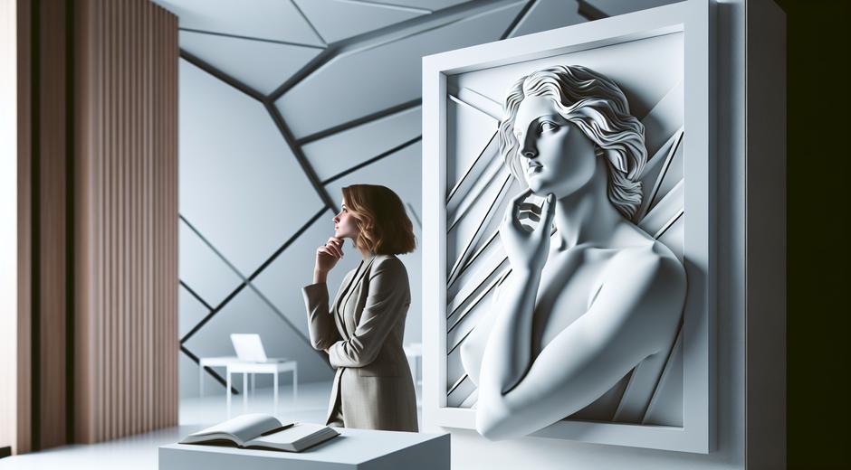
Consider a retail store that uses a muted concrete floor warm wood shelving and a single copper fitting. The copper becomes the focal point and the entire space feels curated. Or a portrait photograph that places a subject in soft grey clothing against a slightly darker backdrop with a single catch light in the eye. The contrast is small but it directs attention and creates emotional clarity. These examples show that restraint can amplify meaning.
Why Quiet Contrast Works for Long Term Style
Quiet Contrast aligns with sustainable thinking because it favors pieces that age well and remain relevant. A design built on subtle contrast allows for seasonal updates without major overhaul. It also supports personal expression in a way that is adaptable. When people invest in materials finishes and proportions rather than trend specific colors they create environments and looks that feel authentic and enduring.
Conclusion
Quiet Contrast is a versatile and strategic approach to design and style. It is about making thoughtful choices that create impact through restraint. Whether you are building a room a wardrobe a brand or a visual story the concept helps you direct attention with elegance. To keep exploring trend driven ideas and practical guides that will help you adapt Quiet Contrast to your own projects visit the curated trend pages at styleradarpoint.com and find visual inspiration and expert tips.
Embrace Quiet Contrast and let small differences create big impressions.


